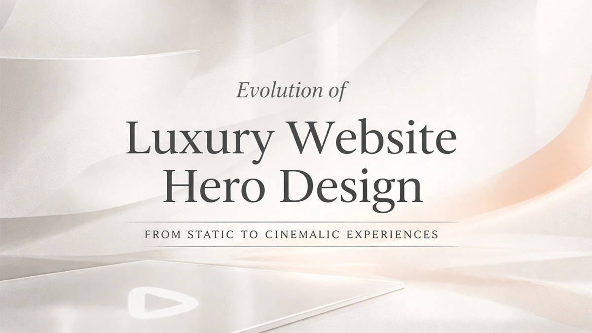
If you see the website design trends, the hero section is evolving. Quietly, but decisively.
Walk through the homepages of the world’s most considered luxury brands right now and you’ll notice something’s shifting. That full-bleed image. The centred tagline. The obligatory CTA button floating over a lifestyle shot.
It’s all starting to feel… expected. And in the world of premium branding, expected is expensive.
Audiences don’t linger on homepages anymore. They make decisions in under two seconds, often before a single word is read. If your site opens with a static hero image, you have already lost momentum. You are asking them to wait. And they won’t.
So what are luxury brands doing instead?
1. Ambient Video That Doesn’t Announce Itself
Forget autoplay reels with sound. The new standard is subtle, cinematic motion; think slow pans, textural close-ups, or product interactions shot in near-silence. It’s video, but it feels like atmosphere.
Brands like Aesop and Byredo have mastered this. Their homepages don’t announce themselves. They breathe. The motion is so restrained it almost reads as still, until you realise it’s not.
Why it works: Motion implies life. Life implies craft. Craft implies value. It’s visceral shorthand for quality, delivered before a single product is shown.
We’ve seen this transform outcomes for jewellery brands and premium eCommerce clients. The shift from static to cinematic doesn’t just look better; it performs better. Dwell time increases. Bounce rate drops. Trust builds faster.
2. Micro-Interactions in Place of Static Layouts
Hover over a navigation item, and the page shifts. Scroll slightly, and type reveals itself with weight. Click nothing, and the interface still responds to your presence.
These aren’t gimmicks. They’re signals. They tell the user, “This experience was designed for you, not templated for everyone.”
Luxury watchmakers and high-end fashion houses are leading here. Instead of one hero moment, they’re building homepages that feel reactive- small, considered movements that respect the user’s attention span.
Why it works: Micro-interactions create intimacy. They make digital feel tactile. And for HNI buyers used to bespoke service, that matters.
At Pixtar, we design these details into every digital experience, not as decoration, but as dialogue. Your site should feel like it’s paying attention.
3. The role of “Invisible” Homepage in Website Design Trends
Some premium brands are forgoing the hero section entirely, not replacing it, just removing it.
Instead, you land on a grid. Or a menu. Or a single question. The homepage becomes a gateway, not a stage. It assumes you know why you’re there, and it gets out of your way.
This works especially well for members-only platforms, private sale sites, and luxury service providers. The absence of showiness becomes the statement.
Why it works: Confidence. Only brands certain of their audience can afford to say less.
4. Modular, Scrollable Content Blocks
Rather than one dominant hero pushing everything down, progressive luxury sites now use stacked content modules, each one a micro-hero in its own right.
You scroll, and every 100vh presents a new visual idea: a product in context, a brand statement, an editorial image, a founder quote. It’s homepage-as-magazine, not homepage-as-billboard.
Why it works: It respects the scroll. Users don’t bounce, they explore. And exploration is what converts premium buyers.
What This Means for Your Brand?
According to website design trends, if your homepage still opens with a static image and a tagline, you’re not wrong; you are just no longer leading.
The shift isn’t about being trendy. It’s about acknowledging that first impressions are now measured in motion, not message. Users expect sites to feel considered, responsive and alive.
That doesn’t mean you need to put a lot of money into a video shoot. It means rethinking what “arrival” feels like on your site. Could your hero be replaced by a subtle cinemagraph? A type-forward layout with delayed reveals? A clean grid that doesn’t oversell?
The brands winning in 2026 aren’t the loudest. They are the most intentional.
And if your homepage feels like every other homepage in your category, no matter how beautiful, it’s time to evolve.
Need a homepage that doesn’t just look premium, but feels it?
At Pixtar, we design digital experiences that do more than impress. They convert, retain, and elevate. From brand strategy to web development, we build for the audience that expects more.
Explore our work for the website design trends. Get in touch to start your next project.