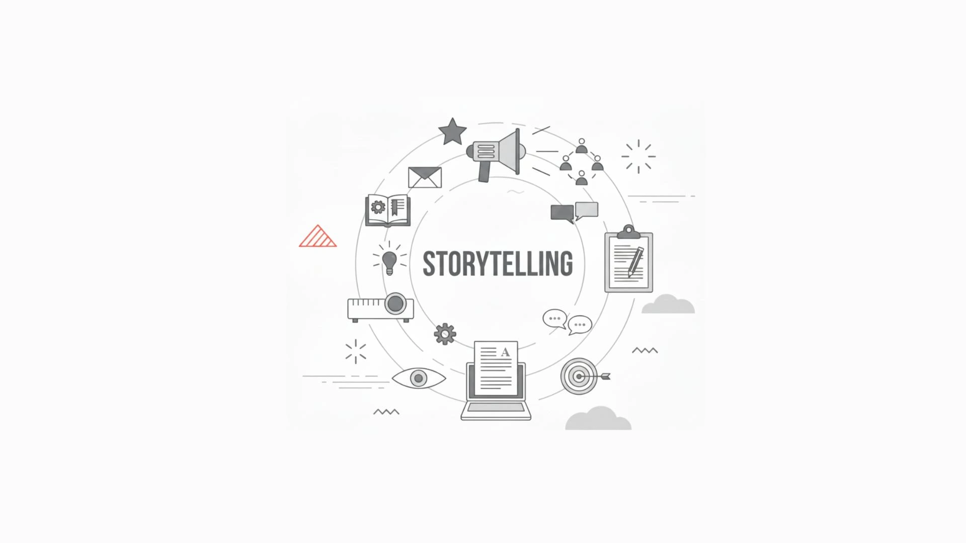
Your pitch deck is not merely a slideshow when you are raising money, but it is your business story in visual representation. Hundreds of decks are shown to most investors each year, and it is the initial impression that usually determines whether the investor will provide a second look. This is the reason why pitch deck design is important.
Let us discuss, what pitch deck design is? Explore common rules like the 10/20/30 rule, review the best formats, and answer few popular questions people ask about pitch decks. We’ll also share why professional design from an agency like Pixtar can make a big difference in how investors perceive your startup.
What Is Pitch Deck Design?
A pitch deck is a short presentation that outlines your business idea, market opportunity, and growth potential to investors. Pitch deck design refers to the way this presentation is visually structured and styled—using layout, branding, colors, and visuals to make your story clear and memorable.
Good design doesn’t mean adding flashy graphics. It means building trust, highlighting your key points and making your deck easy to understand.
The Power of First Impressions
First impressions shape everything. In just seconds, an investor decides whether your pitch is worth of their time or no!! A well designed pitch deck shows:
Professionalism – You are serious about your business.
Clarity – You are able to express concepts easily.
Credibility – You are ready and reliable.
A poorly designed deck may lead to confusion and doubt on your ability to execute your vision.
The 10/20/30 Rule for Pitch Decks
The 10/20/30 rule by Guy Kawasaki is one of the most famous rules of making pitch decks:
- Keep your deck to 10 slides.
- Present it in 20 minutes or less.
- Use at least 30-point font for readability.
This rule forces founders to focus on what really matters, cut out the fluff, and make their message accessible.
What Is the Best Format for a Pitch Deck?
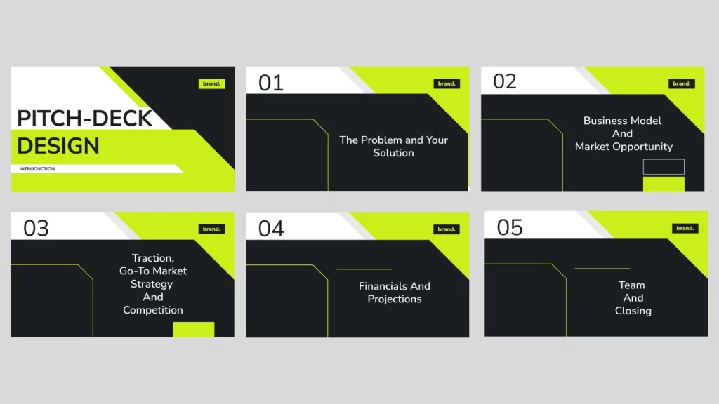
While every startup is unique, the best pitch decks usually follow this structure:
- Introduction/Title Slide
- The Problem
- Your Solution
- Market Opportunity
- Business Model
- Traction (growth, customers, revenue)
- Go-to-Market Strategy
- Competition and Differentiation
- Financials and Projections
- Team & Closing
This format keeps things simple, logical, and aligned with what investors want to know.
Is a Pitch Deck Just a PowerPoint?
No, not at all. A pitch deck is not defined by the tool you use, the main part is story and design. Many founders use PowerPoint however Google slides, Keynote, or Canva. The most important factor is clarity and professionalism not the software.
Pitch deck PDF are also common among founders used for easy emailing and printing.
Common Mistakes That Kill Investor Interest
Even the strongest ideas can be overlooked if the pitch deck is poorly presented. Some mistakes to avoid include:
- Slides with too much text.
- Inconsistent fonts or colors or branding.
- Data-heavy slides without context or visuals.
- Lack of flow or logical storytelling.
- Ignoring design: using plain text instead of charts or graphics.
Pitch Deck Samples and Templates
If you are new to pitching, looking at a pitch deck sample can help you understand what investors expect. There are many pitch deck templates available online which are free, and some can be downloaded as editable pitch deck design PDF.
However, free templates often look generic. For high-stakes fundraising, working with a pitch deck design agency like Pixtar makes sure you get a customized investor-ready presentation that reflects your brand and tells your story effectively.
Best Practices for Investor-Ready Pitch Deck Design
1. Keep It Clear and Simple!!
Limit slides to one key idea each. Replace long text with visuals or bullet points.
2. Maintain consistency in Branding!!
Using your brand colors, fonts and style in a consistent way. Which builds trust and reflects your presentation is polished.
3. Tell a Story
Your Pitch deck should be like a story.
The problems investors should care about
- Your innovative solution
- The size of the opportunity
- Proof of traction and growth
If you provide raw data only it’s not going to be enough. Stories with data forms an impression.
4. Visualize Data
Charts, graphs, and icons communicate faster than text. For example, “$15B market growing at 12% annually” is best shown in a clean graph.
5. Focus on Investors’ Priorities
Your deck should answer the investor’s key questions: Is the market big enough? Is the business scalable? Can this team deliver?
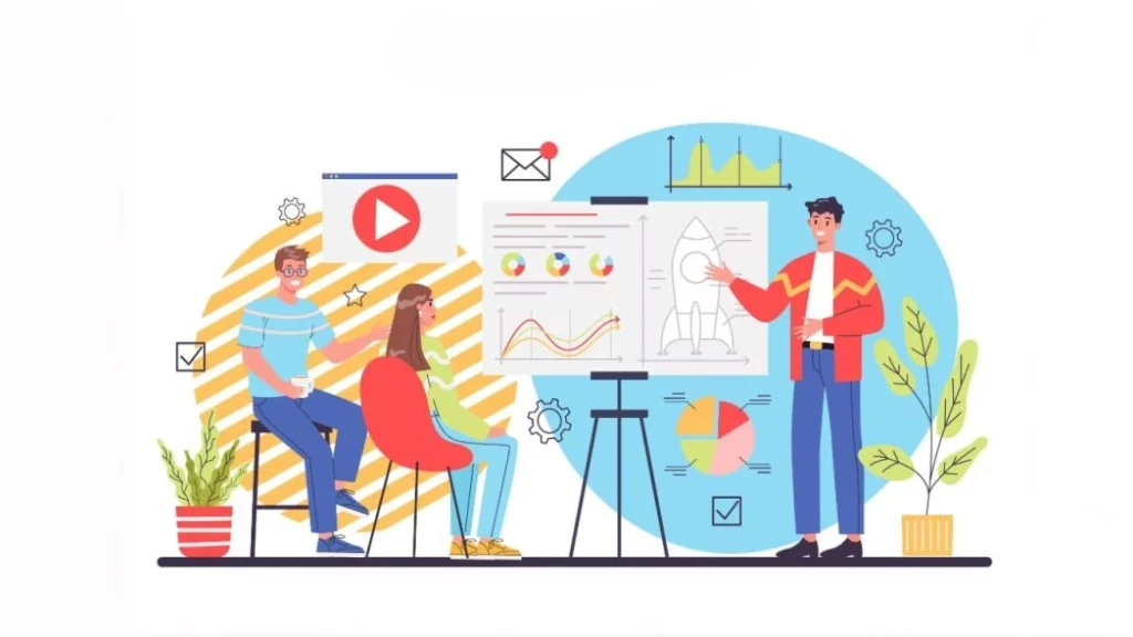
Pitch Deck Design Examples
Airbnb – Famous for its simple, visual deck that clearly explained the problem and solution.
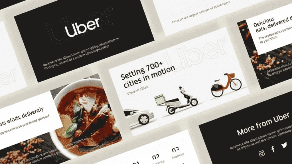
Uber – Early decks focused on the convenience and market opportunity of ride-sharing.
These pitch deck design examples show that simplicity, clarity, and storytelling are something which investors look for.
Final Thoughts
Your pitch deck is more than a slideshow—it’s the first handshake with investors. A weak design can make even the best ideas easy to dismiss, while a strong, well-structured deck creates excitement and credibility.
Just free downloads cannot be relied upon, if you want to standout. Templates are useful for practice, but when it comes to fundraising it should be professional design. That is where Pixtar comes in. We specialize in crafting custom pitch deck designs that focuses on storytelling, branding and data visualization which is the best combination for helping startups to secure investor attention and funding.
Remember: Clarity wins deals. Design shapes clarity.