

Even before your logo, tagline or message, the color of your brand speaks. The splendor of royal blue, or the quiet confidence of charcoal grey, your brand color scheme contributes significantly to the brand perception. If you want your brand to be in the premium space, where emotion, aspiration, and trust matter the color psychology is an important factor which is not only related to design; it’s a strategy.
The First Impression Starts with Color
Studies show that consumers make subconscious judgments about a brand within 90 seconds of first contact—and up to 90% of that judgment is based on color alone.
It implies that even without a word of your text reaching your audience, your brand color is already having a story to say. But what does it tell?
Are you evoking trust, creativity, elegance—or confusion?
The Psychology Behind Popular Brand Colors
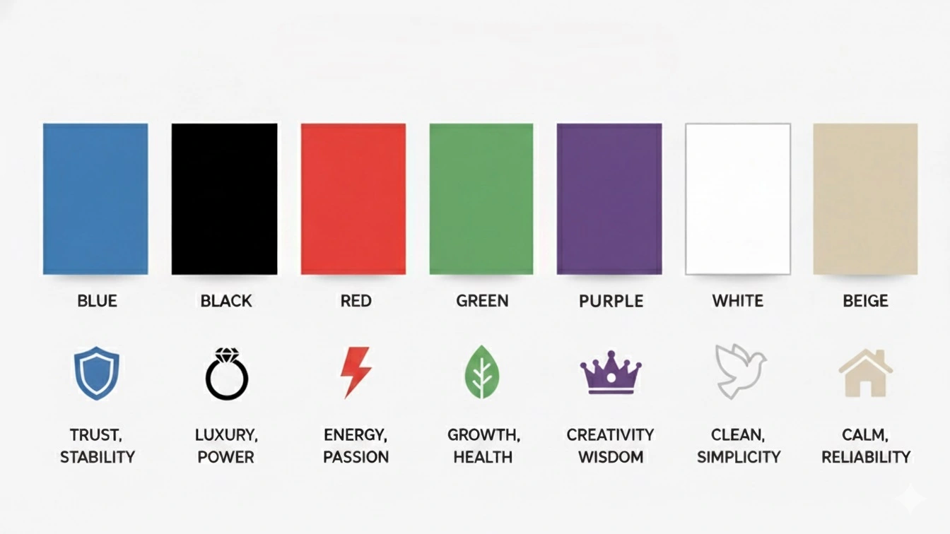
Let’s break down what common colors represent in branding and how they influence consumer perception:
- Blue: Trust, stability, intelligence (Used by banks, tech firms, healthcare)
- Black: Sophistication, luxury, authority (Chanel, Lexus)
- Red: Energy, passion, urgency (Coca-Cola, Netflix)
- Green: Growth, health, balance (Whole Foods)
- Purple: Creativity, wealth, mystery (Cadbury, Hallmark)
- White: Purity, minimalism, clarity (Apple)
- Beige/Taupe: Understated elegance, calm luxury (used in modern minimalist brands)
When selecting colors for a premium or eCommerce brand, understanding these psychological associations is key to building emotional branding that resonates.
Color Psychology and Consumer Emotion: Why It Matters

Color does more than catch the eye—it triggers emotion. And emotion drives decision-making.
A well-chosen color palette in branding can:
- Improve brand recall
- Increase click-through rates (on websites, CTAs)
- Elevate perceived value
- Differentiate you from competitors
For example:
A luxury skincare brand using warm gold and muted ivory communicates softness, prestige, and timelessness, instantly appealing to a premium audience seeking refinement.
Color Consistency Builds Brand Trust
Having the right color is just the start. Using it consistently across all touchpoints—from your website and packaging to social media and invoices—builds brand recognition through color.
Inconsistency in color application confuses customers and weakens identity. Consistency reinforces it, embedding your brand into the subconscious.
Think Tiffany’s blue or Ferrari’s red—you see it, and you know the brand without reading a single word.
Choosing the Right Colors for Your Brand Identity
The approach to choosing the right colors corresponding to your brand identity design is as follows:
- Step 1: Know your brand personality.
Is it bold and dynamic? Calm and trustworthy? Premium and elegant? - Step 2: Understand your audience.
Colors must resonate with who you’re targeting. Youthful tones for Gen Z? Or rich neutrals for luxury focused individuals? - Step 3: Choose a primary and secondary palette.
The primary sets tone; the secondary adds depth and flexibility. - Step 4: Test and validate.
A/B test with landing pages, packaging, or even social posts.
Mistakes to Avoid in Color Branding
- Following trends blindly. What is popular on Pinterest might not fit your business model.
- Choosing colors based on personal preference. Always prioritize strategy over taste.
- Too many colors. Keep it tight—two to three main colors max for a premium feel.
Example: How color psychology impacts a business
Imagine a boutique perfume brand in Dubai embracing deep emerald as its core shade—symbolizing nature, exclusivity, and balance. Paired with matte gold, it radiates luxury with an earthy soul. This palette would resonate deeply with eco-conscious, premium buyers—sparking emotional loyalty.
Conclusion:
The color of your brand is not a decoration hidden in the detail but a psychological indicator. One that speaks volumes before you do. Whether you’re building a new identity or rebranding, remember: color isn’t just visual. It’s visceral.
So, what is your brand color really saying?
Want assistance developing a color palette that is right and works better?
Let Pixtar craft a visual identity that speaks louder than words.