Nobody likes waiting. But in luxury website loading experience design, wait time doesn’t have to feel like wasted time. While most brands treat loading screens as necessary evils, premium brands are turning them into brand moments, using animation, messaging and design to reinforce craft while the page loads.
It’s not about making users wait longer. It’s about making the wait feel intentional. Because even a two-second delay can feel elegant if it’s designed well. And for luxury brands, every touchpoint matters. Including the ones most brands ignore.
Why Loading Screens Still Exist (And Why They Matter)
In an ideal world, every page would load instantly. But real-world conditions—heavy images, custom animations, complex eCommerce systems, mean some delay is inevitable.
Most brands try to hide this. They show spinning circles or generic progress bars. The message is clear: “Sorry, please wait.”
But premium brands take a different approach. They treat the luxury website loading experience as an opportunity. A moment to remind users of the brand’s identity. A chance to set the tone before the content even appears.
Done well, a loading screen doesn’t feel like friction. It feels like transition. Like the pause before a stage curtain rises. And that pause, when designed with intention, can actually enhance the experience.
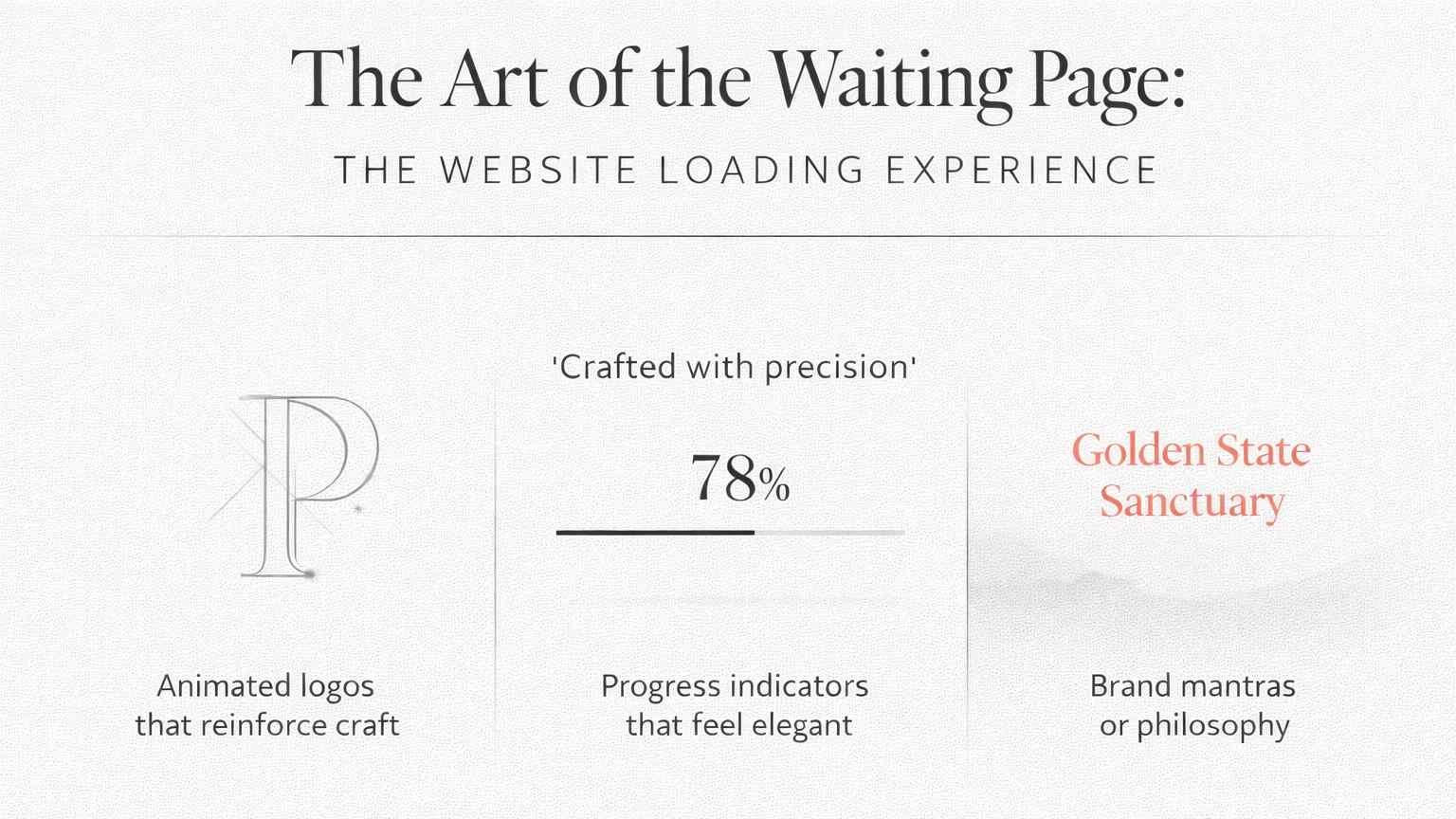
What Premium Loading Screens Actually Do
Animated logos that reinforce craft. Instead of a static logo, luxury brands animate their mark, lines drawing in, elements assembling, motion that suggests precision and care. It’s not decoration. It’s communication. The animation says: this brand pays attention to detail.
Brand mantras or philosophy. Some premium brands use loading time to display a short statement—a brand belief, a founder quote, a single word that captures the ethos. It’s subtle, but it primes the user’s mindset before they engage with the content.
Progress indicators that feel elegant. Not spinning circles, but refined loaders—minimal progress bars, percentage counters in serif type, or abstract shapes that shift gracefully. The goal isn’t just to show progress. It’s to do it in a way that feels consistent with the brand’s visual language.
At Pixtar, we design luxury website loading experiences that feel like part of the brand story, not interruptions to it. We use motion, type, and pacing to turn wait time into a moment of anticipation.
The Psychology of Elegant Waiting
There’s actual research on this. Studies from the Nielsen Norman Group on response times show that perceived wait time matters more than actual wait time. A three-second load with a beautiful website loading animation can feel faster than a two-second load with a blank screen.
Why? Because branded loading screens give users something to focus on. The brain isn’t sitting in a void wondering what’s happening. It’s engaged. And engagement shortens perceived time.
Premium brands understand this. They know that luxury website loading experience isn’t just about speed. It’s about how the wait feels. And a well-designed loader makes the wait feel purposeful, not frustrating.
When Loading Screens Backfire
Not all loading animations work. Done poorly, they make things worse.
Overly long animations. If your animation takes five seconds but the page loads in two, you’re adding unnecessary delay. The loader should never be slower than the load.
Animations that feel cheap. A bouncing icon or pulsing circle doesn’t elevate a luxury brand. It makes it feel generic. The loader needs to match the sophistication of the brand.
No clear feedback. Users need to know something’s happening. If your loader is so minimal it’s unclear whether the page is frozen or loading, you’ve lost them.
The key is balance. The luxury website loading experience should feel intentional but not indulgent. Elegant but not distracting. A moment of calm before the content arrives.
Examples That Get It Right
High-end fashion brands often use slow, cinematic fades, no aggressive spinners, just a gentle transition from loader to content. It feels like the site is taking a breath.
Luxury watchmakers sometimes display intricate line animations: gears assembling, mechanisms interlocking, echoing the precision of their products.
Premium hospitality brands use ambient imagery, a softly animated landscape or abstract texture, creating mood before the homepage even loads.
These aren’t random choices. They’re strategic. Each one reinforces the brand’s identity in the brief moment before the user sees anything else.
At Pixtar, we design loading experiences that align with your brand’s tone, whether that’s minimalist restraint, kinetic energy, or quiet elegance.
The Bigger Picture
Loading screens are small moments. But in luxury website loading experience design, small moments add up.
If every interaction feels considered, users start to trust the brand. They assume the same care goes into the products, the service, and the entire experience. And that assumption is worth protecting.
Most brands treat load time as a problem to solve. Premium brands treat it as an opportunity to reinforce who they are.
Want a website where even the waiting feels intentional?
At Pixtar, we design luxury website loading experiences that turn transitions into brand moments. From animated logos to elegant progress indicators, we build digital experiences where every detail matters.
Explore our work or get in touch to elevate your digital presence.