Before anyone reads your tagline or scans your services, they have already formed an opinion about your brand. It happens in seconds. A glance at your website, your social media, your packaging. In that brief moment, people are running a visual audit. And they’re deciding whether you’re worth their time.
This isn’t about being judgmental. It’s about efficiency. Understanding how people judge your brand through visual cues is critical for any premium business. Discerning buyers process visual information faster than text. They’re looking for signals. Signals of quality, attention to detail and whether your brand matches their expectations. Get the visuals wrong, and your carefully crafted messaging never gets a chance.
Your brand first impression happens through visual brand identity elements that communicate before words ever do. Because in those first five seconds, buyers aren’t reading. They’re feeling.
What Creates Instant Brand Perception
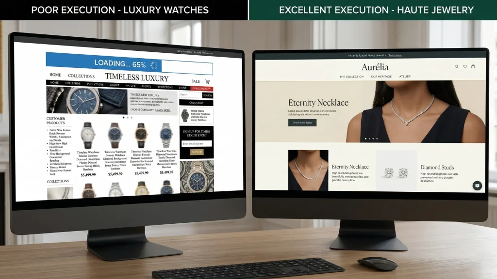
Load speed sets the tone immediately. If your site takes more than three seconds to load, you’ve already communicated something about your brand. That you don’t prioritize user experience. That your site might be outdated or poorly maintained. It gives an impression that your brand is not as premium as you claim.
Speed isn’t just technical. It’s perceptual. Fast sites feel modern, professional, and confident. Slow sites feel neglected. This is one of the first ways how people judge your brand without conscious thought.
Typography speaks before words do. The fonts you choose are crucial elements of visual brand identity. Serif fonts suggest tradition, authority, and craft. Sans-serif fonts feel modern, clean, and approachable. Script fonts can signal elegance or feel overwrought depending on execution.
But beyond style, typography quality matters for brand credibility. Are your font pairings harmonious? Is the hierarchy clear? Can people read your text easily across devices? Premium brands get typography right because they know it’s not decoration. It’s communication.
White space signals confidence. Brands that crowd every pixel with content look desperate. Premium brands use space generously. They let elements breathe. They trust that less is more.
White space isn’t empty. It’s intentional. It creates focus. It guides the eye. It makes everything else on the page feel more valuable. When buyers see generous spacing, they subconsciously register quality and thoughtfulness. This directly impacts brand perception and brand trust.
Color choices reveal positioning. Muted, sophisticated palettes suggest luxury and restraint in luxury brand design. Bright, saturated colors can feel energetic or cheap depending on context. Color contrast affects readability and accessibility, but it also shapes brand perception.
Premium buyers notice when colors clash or when palettes feel generic. They notice when brands use too many colors or when everything feels monotone. Color is emotional. And in five seconds, emotion drives how people judge your brand more than logic.
At Pixtar, we approach visual brand identity knowing that these elements work together to create instant brand credibility. Every choice either builds brand trust or raises doubt.
The Details That Shape Website First Impression
Image quality matters. Blurry photos, poorly cropped images, or obvious stock photography all signal lack of investment. Premium buyers expect sharp, well-composed visuals that feel authentic to your brand first impression.
Consistency across touchpoints. If your website feels polished but your social media looks thrown together, buyers notice the disconnect. Visual consistency suggests operational excellence. Inconsistency suggests lack of attention.
Mobile experience counts. More buyers browse on phones first. If your mobile site feels like an afterthought with tiny text, difficult navigation, or broken layouts, you’ve failed the visual audit before they reach your content.
Animation and transitions. Subtle, smooth animations feel premium. Jerky, excessive movement feels amateur. The way elements appear, transition, and respond to interaction all contribute to perceived quality.
Why Brand Perception Forms So Quickly
Our brains process images 60,000 times faster than text. We’re wired to make quick judgments based on visual patterns. This evolutionary trait helped our ancestors assess threats and opportunities instantly. Today, it helps buyers sort through endless options quickly.
Premium buyers have trained eyes. They’ve seen enough luxury brands to recognize the patterns. They know what quality looks like. They can spot the difference between thoughtful design and templates. Between custom and generic. Between craft and convenience.
You can’t fake this. You can’t trick discerning buyers with one polished element while the rest falls short. They’ll notice. And they’ll move on.
How to Improve Your Brand First Impression
Invest in speed. Optimize images. Choose quality hosting. Make load time a priority, not an afterthought. Every second counts in how people judge your brand.
Get typography right. Choose fonts that match your brand positioning. Ensure proper hierarchy. Test readability across devices. If in doubt, simpler is safer than experimental.
Embrace white space. Don’t cram. Give elements room. Create breathing space. Let your content feel uncrowded and intentional.
Choose colors strategically. Develop a cohesive palette. Test contrast for readability. Ensure colors feel appropriate for your positioning and strengthen brand perception.
Use authentic visuals. Invest in custom photography or illustration. If you must use stock, choose carefully and edit to match your visual brand identity.
Maintain consistency. Every touchpoint should feel like it belongs to the same brand. Website, social media, email, packaging. Visual coherence builds brand trust.
At Pixtar, we design brands knowing that visual first impressions determine whether buyers engage with your message at all. We optimize every visual element to pass that critical five-second audit and build lasting brand credibility.
The Bottom Line
How people judge your brand happens visually before they read a single word. Load speed, typography, white space, color, image quality. All of it registers in seconds. All of it shapes brand perception.
Your messaging matters. But if your brand first impression fails, your message never gets heard. Pass the visual audit first through strong visual brand identity. Then your words will land with the audience you’ve earned the right to speak to.